
Friday, June 13, 2014

Sunday, March 24, 2013
Behind The Scenes: Unfit For Work -- The Startling Rise of Disability in America
I thought I knew the state of the economy in the U.S.
I cover the jobs report on a monthly basis for my current gig at Planet Money and have looked at so many spreadsheets about the U.S. economy that I can cite last month's unemployment rate in my sleep.
But then in July last year my colleague Chana Joffe-Walt asked me to look into some numbers of disability benefits. The rise of the number of people on disability was staggering.
It seemed like disability had become a safety net for many lower-skilled workers who were struggling to find work:
 For a lot of poor people it became a different kind of welfare:
 These discoveries drove home the point that one data report is just incredibly insufficient in explaining the health of our economy. Sure, unemployment is going down and the economy is recovering, very slowly but steadily. However, this program was literally hiding all of these people from the official jobs report (they are not counted as part of the labor force because they don't work and are hence not seen as unemployed). Chana's story made it clearer to me just how important it is to look at different sectors to understand the whole picture. The article summed that up nicely:
 Her This American Life story, 'Trends With Benefits,' will air this weekend.
From Numbers To People
But numbers alone don't make a story. They allow you to find them. If there's one thing I've learned from working at Planet Money it's that few people will care about your numbers unless you find the people behind them.
Chana is probably one of the best reporters I know when it comes to personifying statistics. She found a teenager in Florida whose ability to purchase a house really showed just how bad the housing market and prices were. She also explained the Greek debt crisis through the story of one accountant who faced life in prison for doing math.
The housing market. A debt crisis. Hugely important stories. Usually told in dry jargon. But she's been a incredible at finding the right kind of people to focus on.
In this story, it was great to see that data can be a wonderful starting point for finding people (or places) that are interesting. We found state-level data to look at the states where the highest percentage of the population was receiving disability. Then we went more granular, asking ourselves: which county in that state has a really high percentage of people on disability? That's how we arrived in Hale County, where one in four adults was on disability.
Chana took a trip down there and a lot of color emerged from the black-and-white spreadsheets: in one of the towns, people literally line up to pay their bills on the day they receive their disability checks. A doctor talks about how he sees a lot of people who are applying to get onto disability. The local jobs listings show that many people who do suffer from physical problems won't be able to get a job that doesn't require standing all day. All the puzzle pieces fall into place when you look at the whole picture. And the numbers become all the more real.
Jack of All Trades, Master Project Manager?
From a technical and story-telling standpoint, building this project was immensely satisfying. I think more and more people are coming around to the fact that non-text storytelling components should not merely be treated as 'art.' While at many organization that means publishing some multimedia and interactive components on their own (standalone interactives or multimedia), increasingly large organizations are coming around to the idea of combining elements to tell coherent stories. There's the much-talked-about and beautifully executed "Snow Fall," a New York Times project that used interactive and multimedia components to punctuate and emphasize parts of the story without interrupting the flow of it. We modeled this specific project after a story that the Verge did about American game consoles.
What's more is that I finally felt like I was able to practice multiple skills both in producing components for the projects (infographics design, photography, video editing) but also in managing the project. My editors, Alex Blumberg, Jacob Goldstein and I all have a bit of knowledge of the different storytelling modes: Alex has done extensive work for This American Life's documentary shows a few years back and Jacob has been wonderful at editing both my data work and my infographics in the past few months. Between the three of us we were able to have really constructive and informed discussions of the role each element would play in adding value to the story. How does the placement of a graphic interrupt or enhance a story? Would a graphic do a better job at explaining a point than a paragraph? How important is it to see the characters of this story at this point in the text? Which calculations in this spreadsheet are ethically responsible and which ones might be misleading?
Having three people be familiar with all elements and with the overall story was great in finding a unified voice for the entire piece.
There were many projects that led up to this one that made this work process easier -- I was the main multimedia producer, graphics artist and -- believe it or not -- stage manager/prop builder for Planet Money's live show; I had shot and produced a fake political ad, and I had made many graphics-driven blogposts leading up to this. We all learned from each other through these experiences: what worked and what didn't work on stage. What worked and didn't work visually when it came to graphics. What's too pretty and not informative enough, and what is too plain but incredibly clear in telling a data story. The collaborative nature of the work process was something I had relished in journalism school and was happy to find again in the small 'department' of Planet Money. It's something that sometimes gets lost in larger organizations where you have departments that are completely segregated from one another.
Let's see what we will tackle next.
Her This American Life story, 'Trends With Benefits,' will air this weekend.
From Numbers To People
But numbers alone don't make a story. They allow you to find them. If there's one thing I've learned from working at Planet Money it's that few people will care about your numbers unless you find the people behind them.
Chana is probably one of the best reporters I know when it comes to personifying statistics. She found a teenager in Florida whose ability to purchase a house really showed just how bad the housing market and prices were. She also explained the Greek debt crisis through the story of one accountant who faced life in prison for doing math.
The housing market. A debt crisis. Hugely important stories. Usually told in dry jargon. But she's been a incredible at finding the right kind of people to focus on.
In this story, it was great to see that data can be a wonderful starting point for finding people (or places) that are interesting. We found state-level data to look at the states where the highest percentage of the population was receiving disability. Then we went more granular, asking ourselves: which county in that state has a really high percentage of people on disability? That's how we arrived in Hale County, where one in four adults was on disability.
Chana took a trip down there and a lot of color emerged from the black-and-white spreadsheets: in one of the towns, people literally line up to pay their bills on the day they receive their disability checks. A doctor talks about how he sees a lot of people who are applying to get onto disability. The local jobs listings show that many people who do suffer from physical problems won't be able to get a job that doesn't require standing all day. All the puzzle pieces fall into place when you look at the whole picture. And the numbers become all the more real.
Jack of All Trades, Master Project Manager?
From a technical and story-telling standpoint, building this project was immensely satisfying. I think more and more people are coming around to the fact that non-text storytelling components should not merely be treated as 'art.' While at many organization that means publishing some multimedia and interactive components on their own (standalone interactives or multimedia), increasingly large organizations are coming around to the idea of combining elements to tell coherent stories. There's the much-talked-about and beautifully executed "Snow Fall," a New York Times project that used interactive and multimedia components to punctuate and emphasize parts of the story without interrupting the flow of it. We modeled this specific project after a story that the Verge did about American game consoles.
What's more is that I finally felt like I was able to practice multiple skills both in producing components for the projects (infographics design, photography, video editing) but also in managing the project. My editors, Alex Blumberg, Jacob Goldstein and I all have a bit of knowledge of the different storytelling modes: Alex has done extensive work for This American Life's documentary shows a few years back and Jacob has been wonderful at editing both my data work and my infographics in the past few months. Between the three of us we were able to have really constructive and informed discussions of the role each element would play in adding value to the story. How does the placement of a graphic interrupt or enhance a story? Would a graphic do a better job at explaining a point than a paragraph? How important is it to see the characters of this story at this point in the text? Which calculations in this spreadsheet are ethically responsible and which ones might be misleading?
Having three people be familiar with all elements and with the overall story was great in finding a unified voice for the entire piece.
There were many projects that led up to this one that made this work process easier -- I was the main multimedia producer, graphics artist and -- believe it or not -- stage manager/prop builder for Planet Money's live show; I had shot and produced a fake political ad, and I had made many graphics-driven blogposts leading up to this. We all learned from each other through these experiences: what worked and what didn't work on stage. What worked and didn't work visually when it came to graphics. What's too pretty and not informative enough, and what is too plain but incredibly clear in telling a data story. The collaborative nature of the work process was something I had relished in journalism school and was happy to find again in the small 'department' of Planet Money. It's something that sometimes gets lost in larger organizations where you have departments that are completely segregated from one another.
Let's see what we will tackle next.
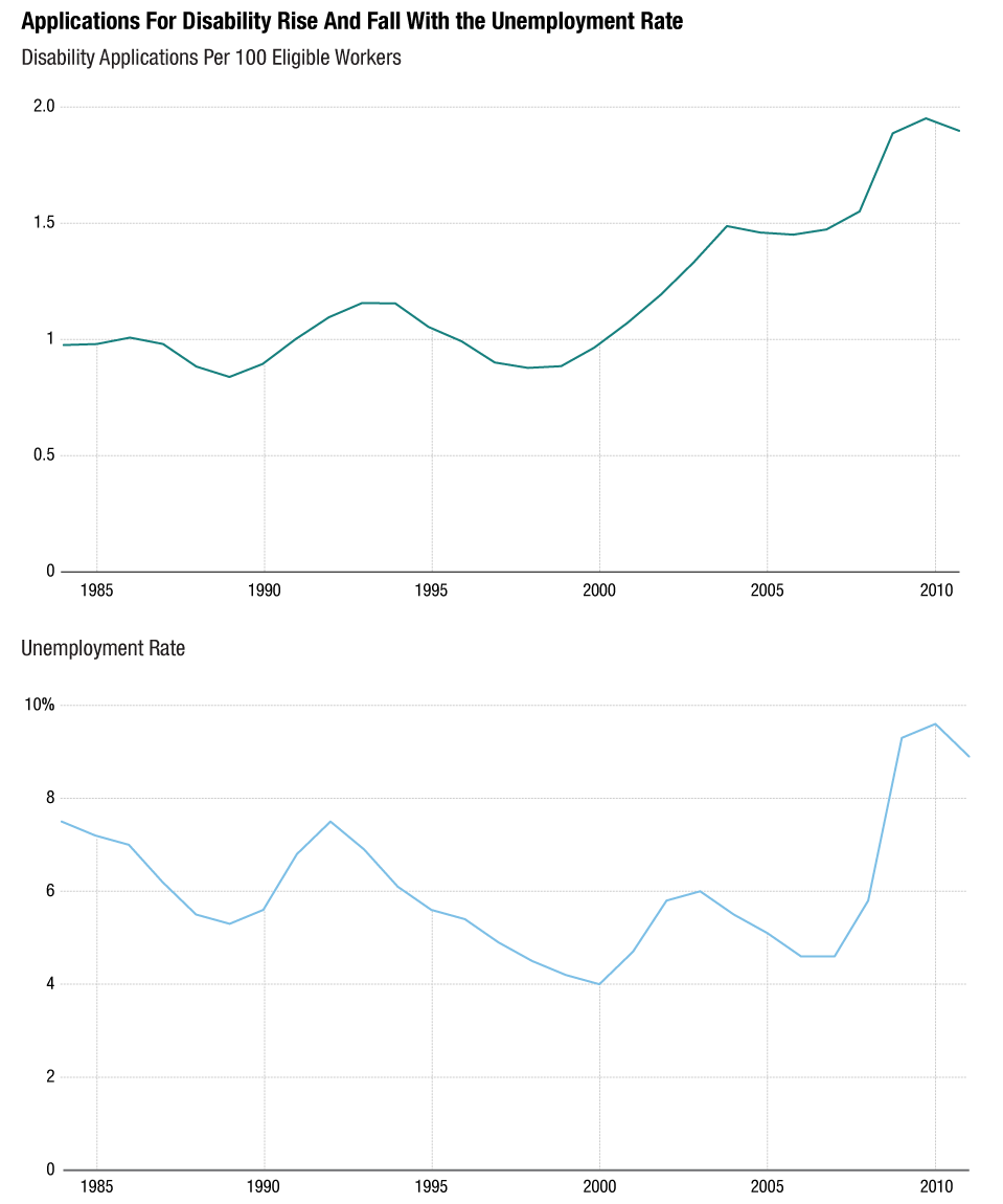 For a lot of poor people it became a different kind of welfare:
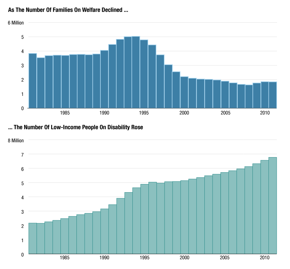 These discoveries drove home the point that one data report is just incredibly insufficient in explaining the health of our economy. Sure, unemployment is going down and the economy is recovering, very slowly but steadily. However, this program was literally hiding all of these people from the official jobs report (they are not counted as part of the labor force because they don't work and are hence not seen as unemployed). Chana's story made it clearer to me just how important it is to look at different sectors to understand the whole picture. The article summed that up nicely:
Somewhere around 30 years ago, the economy started changing in some fundamental ways. There are now millions of Americans who do not have the skills or education to make it in this country. Politicians pay lip service to this problem during election cycles, but American leaders have not sat down and come up with a comprehensive plan. In the meantime, federal disability programs became our extremely expensive default plan.The result of Chana's exceptional reporting is here:
Her This American Life story, 'Trends With Benefits,' will air this weekend.
From Numbers To People
But numbers alone don't make a story. They allow you to find them. If there's one thing I've learned from working at Planet Money it's that few people will care about your numbers unless you find the people behind them.
Chana is probably one of the best reporters I know when it comes to personifying statistics. She found a teenager in Florida whose ability to purchase a house really showed just how bad the housing market and prices were. She also explained the Greek debt crisis through the story of one accountant who faced life in prison for doing math.
The housing market. A debt crisis. Hugely important stories. Usually told in dry jargon. But she's been a incredible at finding the right kind of people to focus on.
In this story, it was great to see that data can be a wonderful starting point for finding people (or places) that are interesting. We found state-level data to look at the states where the highest percentage of the population was receiving disability. Then we went more granular, asking ourselves: which county in that state has a really high percentage of people on disability? That's how we arrived in Hale County, where one in four adults was on disability.
Chana took a trip down there and a lot of color emerged from the black-and-white spreadsheets: in one of the towns, people literally line up to pay their bills on the day they receive their disability checks. A doctor talks about how he sees a lot of people who are applying to get onto disability. The local jobs listings show that many people who do suffer from physical problems won't be able to get a job that doesn't require standing all day. All the puzzle pieces fall into place when you look at the whole picture. And the numbers become all the more real.
Jack of All Trades, Master Project Manager?
From a technical and story-telling standpoint, building this project was immensely satisfying. I think more and more people are coming around to the fact that non-text storytelling components should not merely be treated as 'art.' While at many organization that means publishing some multimedia and interactive components on their own (standalone interactives or multimedia), increasingly large organizations are coming around to the idea of combining elements to tell coherent stories. There's the much-talked-about and beautifully executed "Snow Fall," a New York Times project that used interactive and multimedia components to punctuate and emphasize parts of the story without interrupting the flow of it. We modeled this specific project after a story that the Verge did about American game consoles.
What's more is that I finally felt like I was able to practice multiple skills both in producing components for the projects (infographics design, photography, video editing) but also in managing the project. My editors, Alex Blumberg, Jacob Goldstein and I all have a bit of knowledge of the different storytelling modes: Alex has done extensive work for This American Life's documentary shows a few years back and Jacob has been wonderful at editing both my data work and my infographics in the past few months. Between the three of us we were able to have really constructive and informed discussions of the role each element would play in adding value to the story. How does the placement of a graphic interrupt or enhance a story? Would a graphic do a better job at explaining a point than a paragraph? How important is it to see the characters of this story at this point in the text? Which calculations in this spreadsheet are ethically responsible and which ones might be misleading?
Having three people be familiar with all elements and with the overall story was great in finding a unified voice for the entire piece.
There were many projects that led up to this one that made this work process easier -- I was the main multimedia producer, graphics artist and -- believe it or not -- stage manager/prop builder for Planet Money's live show; I had shot and produced a fake political ad, and I had made many graphics-driven blogposts leading up to this. We all learned from each other through these experiences: what worked and what didn't work on stage. What worked and didn't work visually when it came to graphics. What's too pretty and not informative enough, and what is too plain but incredibly clear in telling a data story. The collaborative nature of the work process was something I had relished in journalism school and was happy to find again in the small 'department' of Planet Money. It's something that sometimes gets lost in larger organizations where you have departments that are completely segregated from one another.
Let's see what we will tackle next.
Thursday, November 1, 2012
Recent Work: Halloween On Wall Street 2012
I spent yesterday evening walking around lower Manhattan for an NPR blog post, which was deserted. Much of that part of the city is still without electricity.


Recent Work for NPR: America's Most Expensive Storms
Here are two simple charts I made for a recent post on America's most expensive storms.
It's interesting that we continue to speak about storms and their destruction in dollar amounts. The National Hurricane Center had published two different data sets that ranked America's costliest storms in two ways: one compared storms by inflation-adjusted damages they caused; the other data set compared storms by how much damage they would have done if they had hit the same areas with the same magnitude in 2010.
You can read more about the data here.


Data Docs - an Attempt at Dynamic Video
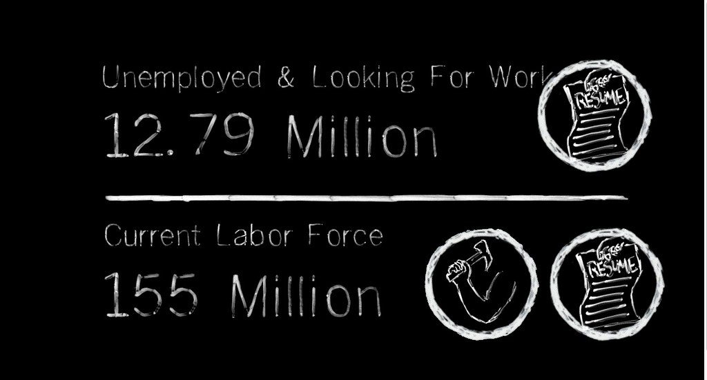
I was pulled in to assist the very talented Joe Posner with animated op-ed videos. Our developer partner was Susan McGregor. We ended up conceptualizing a completely different project that we named "Data Docs."
We're still working on putting the piece together and making it functional, but here's the concept:
We want to create animations that explain data and explain both its value as a way to understand the world and its perils to skew reality. These animations would incorporate data that would be scraped live from continuously updated data bases and super-imposed onto pre-composed video animations. This would ensure that our videos would be evergreens and display the most up-to-date data.
We're hoping to get this done sometime before the end of this year. Fingers crossed!


Friday, October 26, 2012
Recent Work from WSJ: Before You Sign: A Private Student Loan Primer

If you're thinking of cosigning a private student loan for your college bound child or grandchild, you might want to do a little homework first. You can watch the video here.
Tuesday, August 21, 2012



Friday, August 17, 2012


Tuesday, August 7, 2012
Thursday, July 12, 2012
Learn Stuff!
Over the past few years, I've had the pleasure to teach a variety of students. What veteran journalists and middle schoolers have in common? They like handouts.
USC Annenberg's Andrew Lih and I firmly believe in the power of checklists and cheat sheets and we've put together a few one-sheeters for folks to take home. I've started putting the few we've developed on my site and will update it as I produce more.
I'll be developing an online course in data journalism. So look out for more content!

Wednesday, July 11, 2012
Infographics Graveyard
You can't succeed without failing, they say. Here are a few eye-catching but failed data visualizations.


And a few minimalist econ posters that didn't make the cut:


Tuesday, July 10, 2012
Bo Xilai: Inside The Scandal
Bo Xilai's story is a juicy and complicated one. I spent a good month's worth of nights and weekends trying to disentangle the story of the ousted Chinese politician with Wall Street Journal reporters and editors. We finally turned it into this 17-minute opus.
Monday, July 2, 2012
Immigrants Working in America
Immigration has always been a subject of interest to me. You can probably tell if you scroll through my portfolio of work. Here are two graphics I did for Planet Money on U.S. workers who were born outside of the country.


Tuesday, June 5, 2012
A Few Observations That Have Made Video A Little Harder
Character casting. Back in 2007, when I was working on my master's project on Burmese refugees for several months, I knew that would have to do this to find a decent character for documentary. We interviewed dozens of people, went through several agencies and organizations. Some granted us interviews only to vanish after. Some wanted to tell us about their agenda rather than about their story. And some really disliked the camera. Finally, a month and a half into the research process, we arrived at three main characters. It was an arduous, but ultimately rewarding experience.
Then, after graduation, I entered the world of news.
The Character vs. the Interviewee
What happened there was that speed on superseded character. The nutgraf overruled the uniqueness of an individual shown on camera. They had to be representative of a greater story.
Perhaps that was a newspaper approach to a video package. But it did a number on me.
For many stories, it became about getting the right quote and finding the person with the appropriate background to match a hypothesis, to fit neatly into an idea. That works for a certain kind of video feature, a news-driven feature.
On some level this has also crept into some first person narratives told by individuals representative of a larger trend or of a certain human experience.
There is a lot of heart-tugging work out there in the multimedia-sphere. Master pieces in story crafting, beautifully executed pieces. But sometimes they fall flat of lending their characters a third dimension because they are representing an issue, a trend, a sad saga.
But that runs the hazard of becoming formulaic.
I did a lot of reporting trips while I was based in Hong Kong. Trips that lasted 5 or 10 days tops. My life in Asia consisted of a lot of news and very often representative interviewees. It became a straight-forward task to produce stories (though it always remained hard work). I knew my stories were solid, but I started feeling that something was lacking.
And then -- after listening to the experiences of many documentary filmmakers around me -- it all came back to me. I remembered the Burmese refugees in New York, the hours of footage we wasted trying to find the right people, the effort and time put into that search and the difficulty we had trying to put together these stories. Real characters throw you curve balls; they can be cast as both villains and victims, and they will test your ability to weave together a complex set of facts to paint -- at best -- a Jackson-Pollock-like picture.
Gosh. How I long for this agony!
Radio vs. Video
Working with some amazing radio reporters also reinforced in me one very crucial thing: most media, even radio, can travel into the past. Video can't.
There's a lot of work out there and work I've done, that describes things that happened in the past. Or things that happen every day ("What do you do on a typical day?" I hear myself asking).
"TV where nothing unravels in front of the camera is dead TV," a friend said recently.
There's a lot of broll gathering in today's multimedia work. In other words, there's a lot of beautiful stuff out there. But there is little where things unravel.
The best footage requires time, serendipity and trust from your character. It requires a bit of luck. It also requires lots of time for things to happen. On some level perhaps years (depending on how deep you want to be entrenched in something and how long it takes the story you're pursuing to come to its natural conclusion). And yes, add to that technical and aesthetic skill.
(Re)discovering all this just made me so much more skeptical of my own work, which has been largely driven by news gathering. I will keep working in visual media, don't get me wrong. But it's changed my focus. I used to concentrate on what I realize now are mostly stylistic, methodological aspects of storytelling -- pacing a visually and orally told story, shooting for information and aesthetics, interspersing moments of reflections between anecdotes and action shots.
Now I want real people who do things in front of the camera over time. That'll mean fewer videos. But hopefully better ones, too.
Now I want real people who do things in front of the camera over time. That'll mean fewer videos. But hopefully better ones, too.
Sunday, June 3, 2012
Recent Work: Evan Twyford's Industrial Design for Outer Space
Something I reported back in December. Space is fun.
Thursday, May 24, 2012
Personalized Storytelling: You Can't Do Anything Wrong
My last post for ONA as an MJ Bear Fellow. I had a great time.

Last fall, I found myself in a blizzard-like storm in New York, fighting my way through a thick wall of snow. I had just left my position at the Wall Street Journal in Asia to be with my husband and to pursue full-time reporting. This weather was a reminder of the fact that I was no longer in the comforting tropical climate of Hong Kong and no longer in a comfortable job at a multinational news organization.
I was on my way to the Pageturner Literary Festival to see Junot Diaz speak. He is an author who bedazzled me with his Pulitzer Prize-winning novel “The Brief and Wondrous Life of Oscar Wao.” Coming back to the U.S. had been a bit of an adjustment, and so I was hoping for some advice and counsel — perhaps a shove in the right direction, an uplifting tale of struggle and eventual success from Mr. Diaz.
And he delivered.
OF ENDURANCE AND PATIENCE
“Eleven years is a long time to feel like a loser,” Diaz said at one point in his speech. He was referring to the time it took him to finish his novel about the pudgy Dominican nerd Oscar Wao. Diaz won international acclaim for his book, but it also took him more than a decade to finish it.
He urged the soaking, attentive crowd of aspiring storytellers to be patient with themselves — to give themselves a break.
“When you’re on your sixth year of your novel, and you’ve taught a student how to write a novel in six months, then you start blaming yourself,” he said. “Most of us don’t help ourselves [in those situations]. We tend to double down on the punishment. If the page or the thing [we're] working on is punishing us, we seem to think that that’s somehow a value judgment on ourselves.”
Diaz said we need to give ourselves the same compassion that we do the characters in our stories — in his case they are fictional; in ours they are real.
Ira Glass has a similar plea to young storytellers. Here in this (much-circulated but never old) video, the host and creator of “This American Life” speaks of the need to be patient and continue to produce work — to produce a lot of work and to do so repeatedly, even if the work is not entirely what you want it to be.
It’s not easy to always keep this in mind. We’re young and restless, after all. We want to tell amazing stories. We might go to conflict zones, where we suspect those stories are waiting for us. The falling prices of gadgets and tech gear are on our side, but to be consistently great takes patience with oneself. This is something that I, and perhaps some others in my shoes, lack at times.
OF PERSONAL EXCELLENCE AND AUTHENTICITY
Diaz and Min Jin Lee, the author sharing the stage with Diaz, also talked about artistic integrity. They spoke of editors who wanted them to remove parts of their novels that were integral to their stories and characters, such as Korean words or footnotes. Those elements seemed be too “weird” for their audience, according to those editors.
But instead, Diaz and Lee encouraged the audience to listen to their own understanding of what is, and what isn’t, too experimental for their audience.
“They [your editors] are making economic arguments about aesthetic issues,” Diaz said. “The economic argument should not be made because you aren’t going to make much money doing this.”
Their struggles to sell books is perhaps akin to our need to sell our stories to our editors and to the omnivorous Internet. Sometimes the currency we’re dealing with is not the money people will spend on our books, but the traffic, eyeballs and clicks.
But beyond the short-lived, monetary benefits of traffic and the pats on the back you get from your editor, there’s one quality that’s lasting: What is my own definition of personal excellence in my craft, and how can I reach my selected audience? By that, I don’t mean the voiceless masses that makes up the traffic stream to a website, but the audience I choose to move — the people whom I want to reach.
Who knows whether “traditional media” is a platform for bringing the best you can do to your chosen audience? It could be a documentary about an obscure community you send out to selected screenings. It could be an article such as the hauntingly beautiful and absolutely unconventional account of a man in Japan, floating on his roof for days after the March 2011 earthquake and tsunami destroyed his village.
There’s nothing wrong with striving to find your own voice, both authors urged. For us, this is something that can, and sometimes cannot, be done in the field of journalism.
“There is the idea that there is this right path,” Diaz said. But if you haven’t taken it “you haven’t done anything wrong.”
“Didn’t take an MFA? You didn’t do anything wrong.
Took you 11 years to write your book? You didn’t do anything wrong.
Don’t feel like writing about your family? You didn’t do anything wrong.
You do feel like writing about your family? You didn’t do anything wrong.”
Took you 11 years to write your book? You didn’t do anything wrong.
Don’t feel like writing about your family? You didn’t do anything wrong.
You do feel like writing about your family? You didn’t do anything wrong.”
Well, I’m not sure whether I’m spreading myself too thin by trying to work with every medium. I’m not sure whether I did the right thing by leaving Asia. But I didn’t do anything wrong, either.
Monday, May 14, 2012
50 Years of U.S. Government Spending
And here's another slope graph, this time on government spending. I think this one works a bit better than the previous one. It's clearer that there's a progression from one point to another.

You can read a bit more about these numbers here.
Update: Wowsers! People love Tufte's approach to data visualization. This graphic was shared more than 10,000 times on Facebook.
Friday, May 4, 2012
Confessions of a convert: How I came to love blogging
Another post I did for the Online News Association.
Ugh, the blog format. For a lover of long-form magazine stories and documentaries, I was never the biggest fan.
With blogs came shortened word counts, limited visual capabilities and a curtailed shelf life (although that might be arguable).
But necessity is the mother of invention, and there have been a number of folks who took the format, ran with it and converted me (which is good because I now work on a blog).
SHORT FORM VS. MINI SITE
Here’s one of the hardest things I had to swallow. The kind of journalism I loved to do, the long-form multimedia projects and the mini-sites for special coverage, aren’t the way people enter a website anymore.

Less of this?
How we get to our reading and viewing material has changed. Big destination sites don’t garner the kind of audiences that a series of or even just one well-done shorter piece get.
Yes, long-form journalism — meaning longer articles — might have caught a second wind from the rise of the iPad, the Kindle and other tablets. But special mini-sites haven’t enjoyed the same renaissance — at least that’s what I gather from anecdotal evidence. These sites might not die, but they certainly are going to be rarer.
But just because my work is being parceled into bite-sized posts on online avenues doesn’t mean I have to compromise quality in reporting and multimedia storytelling, right? Here’s why.
A STAGE FOR EXPERIMENTATION
Some of the most interesting developments in our recent news gathering — from real-time coverage to more integrated interplay of multimedia elements and text — are perfect for blogs.
One of the first multi-format bloggers I started noticing was a former Wall Street Journal colleague Zach Seward.
Before starting at The Atlantic, the former WSJ social media editor caught my attention with playful posts like this one, titled “Everything the Internet Knows About Me (Because I Asked It To)” or this one, called “Listen to the Obama Campaign’s Soundtrack”.

Everything the Internet Knows about Zach Seward (The Wall Street Journal)
The beauty of these posts is that they are not necessarily bound to text, and they weigh each element equally. As someone who’s always worked on “art for stories,” it’s nice to see someone practice what we always preach: Treat all media equally and use each according to their strength.
Another great development on blogs that’s now gained enough traction to get the attention of the Pulitzer Prizes is live coverage. The Guardian was one of the first publications to fully embrace and then refine the art of live blogging, a news reporting format that has won more prominence with the rise of twitter.
One of the Guardian’s earliest live products, its soccer (or football) live blogs, is a great example of value-added live coverage. The writers are hilarious, well-informed commentators who offer a different view of the game while delivering basic information.
Sports events, awards ceremonies and other “low-pressure” live events also are a great training ground for live coverage of news. Live blogging later became a central tool for the Guardian’s coverage of the Arab Spring, and transformed it into both a news delivery system and a crowd-sourcing platform.
A more traditional print reporter once told me that blog posts are for reporters to “dump” into whatever didn’t make it into the “actual” story, which reduces blogs to the function of traffic-generating byproducts. But I see a blog as a vehicle for experimentation, integrated, multiple-platform storytelling — a tool with specific strengths, useful for certain stories.
SERIAL BLOGGING
Blogs lack depth, some would say. And while you might not get as much out of a 300-word post as you would a 5,000-word article, blogs do offer room for developing a deeper understanding of a story or subject over time.
Serial coverage of a subject can unravel nicely over a blog, which can provide more flexibility to react to recent developments. When we think of superficial blogs, we think of posts that “recycle” other people’s reporting. And while that is part of the blogosphere, there’s some great original reporting in blogs.
The Atlantic, for instance, is rolling out a series on spending, which combines smart reporting with graphics and guest entries. On some level, this is just a way to parcel out great coverage of a subject.
Maybe my long-form projects don’t have to die. They just have to be repackaged.
Tuesday, April 24, 2012
Evolution of an Infographic: What America Buys
So, I've re-entered the realm of making data look pretty and informative, after spending the past few years in the realm of video. The two things that have been pretty interesting:
1.) There's plenty of data out there, just never the kind of data set you want. Getting that data set takes a lot of phone calls and pestering people.
2.) There's a lot of thought that goes into the clear and good communication of information. And sometimes your favorite graphic will be cut.
That's what happened here.

We had ranked the left-hand column in order of size (with the exception of the amorphous category of 'other') and kept that order for the left column for easier comparison.
But I was a little worried that the changes of our spending would get lost in that comparison. The graphic would force people to read the individual numbers to compare the hierarchy of spending in 1949 and today.
So we tried to visualize the changes in spending in a Tuftean way, using his lesser known model of slopegraphs.


All in all, it took us two other, prettier and perhaps more confusing graphics to get back to our original one. We had a vote among colleagues and they voted for the very first bar chart.
Update: later the third version of the graphic became a very useful way to tell stories of change over time. My editor gave a different version of the same graphic-combo a greenlight, which now has become a regular data visualization we use.
1.) There's plenty of data out there, just never the kind of data set you want. Getting that data set takes a lot of phone calls and pestering people.
2.) There's a lot of thought that goes into the clear and good communication of information. And sometimes your favorite graphic will be cut.
That's what happened here.
We had ranked the left-hand column in order of size (with the exception of the amorphous category of 'other') and kept that order for the left column for easier comparison.
But I was a little worried that the changes of our spending would get lost in that comparison. The graphic would force people to read the individual numbers to compare the hierarchy of spending in 1949 and today.
So we tried to visualize the changes in spending in a Tuftean way, using his lesser known model of slopegraphs.
That was a little too minimalist and somewhat confusing.
The combination of both approaches (and my personal favorite) is shown below:
All in all, it took us two other, prettier and perhaps more confusing graphics to get back to our original one. We had a vote among colleagues and they voted for the very first bar chart.
Update: later the third version of the graphic became a very useful way to tell stories of change over time. My editor gave a different version of the same graphic-combo a greenlight, which now has become a regular data visualization we use.
Subscribe to:
Posts (Atom)