
Friday, June 13, 2014
Sunday, March 24, 2013
Behind The Scenes: Unfit For Work -- The Startling Rise of Disability in America
I thought I knew the state of the economy in the U.S.
I cover the jobs report on a monthly basis for my current gig at Planet Money and have looked at so many spreadsheets about the U.S. economy that I can cite last month's unemployment rate in my sleep.
But then in July last year my colleague Chana Joffe-Walt asked me to look into some numbers of disability benefits. The rise of the number of people on disability was staggering.
It seemed like disability had become a safety net for many lower-skilled workers who were struggling to find work:
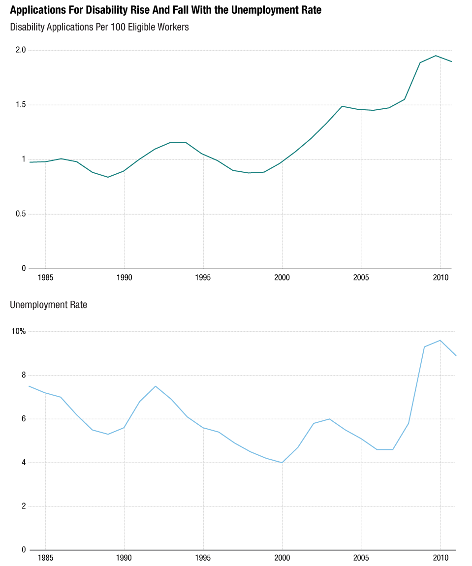 For a lot of poor people it became a different kind of welfare:
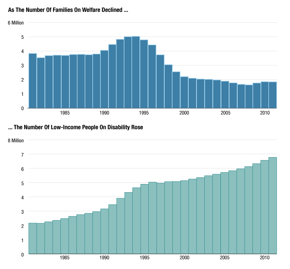 These discoveries drove home the point that one data report is just incredibly insufficient in explaining the health of our economy. Sure, unemployment is going down and the economy is recovering, very slowly but steadily. However, this program was literally hiding all of these people from the official jobs report (they are not counted as part of the labor force because they don't work and are hence not seen as unemployed). Chana's story made it clearer to me just how important it is to look at different sectors to understand the whole picture. The article summed that up nicely:
 Her This American Life story, 'Trends With Benefits,' will air this weekend.
From Numbers To People
But numbers alone don't make a story. They allow you to find them. If there's one thing I've learned from working at Planet Money it's that few people will care about your numbers unless you find the people behind them.
Chana is probably one of the best reporters I know when it comes to personifying statistics. She found a teenager in Florida whose ability to purchase a house really showed just how bad the housing market and prices were. She also explained the Greek debt crisis through the story of one accountant who faced life in prison for doing math.
The housing market. A debt crisis. Hugely important stories. Usually told in dry jargon. But she's been a incredible at finding the right kind of people to focus on.
In this story, it was great to see that data can be a wonderful starting point for finding people (or places) that are interesting. We found state-level data to look at the states where the highest percentage of the population was receiving disability. Then we went more granular, asking ourselves: which county in that state has a really high percentage of people on disability? That's how we arrived in Hale County, where one in four adults was on disability.
Chana took a trip down there and a lot of color emerged from the black-and-white spreadsheets: in one of the towns, people literally line up to pay their bills on the day they receive their disability checks. A doctor talks about how he sees a lot of people who are applying to get onto disability. The local jobs listings show that many people who do suffer from physical problems won't be able to get a job that doesn't require standing all day. All the puzzle pieces fall into place when you look at the whole picture. And the numbers become all the more real.
Jack of All Trades, Master Project Manager?
From a technical and story-telling standpoint, building this project was immensely satisfying. I think more and more people are coming around to the fact that non-text storytelling components should not merely be treated as 'art.' While at many organization that means publishing some multimedia and interactive components on their own (standalone interactives or multimedia), increasingly large organizations are coming around to the idea of combining elements to tell coherent stories. There's the much-talked-about and beautifully executed "Snow Fall," a New York Times project that used interactive and multimedia components to punctuate and emphasize parts of the story without interrupting the flow of it. We modeled this specific project after a story that the Verge did about American game consoles.
What's more is that I finally felt like I was able to practice multiple skills both in producing components for the projects (infographics design, photography, video editing) but also in managing the project. My editors, Alex Blumberg, Jacob Goldstein and I all have a bit of knowledge of the different storytelling modes: Alex has done extensive work for This American Life's documentary shows a few years back and Jacob has been wonderful at editing both my data work and my infographics in the past few months. Between the three of us we were able to have really constructive and informed discussions of the role each element would play in adding value to the story. How does the placement of a graphic interrupt or enhance a story? Would a graphic do a better job at explaining a point than a paragraph? How important is it to see the characters of this story at this point in the text? Which calculations in this spreadsheet are ethically responsible and which ones might be misleading?
Having three people be familiar with all elements and with the overall story was great in finding a unified voice for the entire piece.
There were many projects that led up to this one that made this work process easier -- I was the main multimedia producer, graphics artist and -- believe it or not -- stage manager/prop builder for Planet Money's live show; I had shot and produced a fake political ad, and I had made many graphics-driven blogposts leading up to this. We all learned from each other through these experiences: what worked and what didn't work on stage. What worked and didn't work visually when it came to graphics. What's too pretty and not informative enough, and what is too plain but incredibly clear in telling a data story. The collaborative nature of the work process was something I had relished in journalism school and was happy to find again in the small 'department' of Planet Money. It's something that sometimes gets lost in larger organizations where you have departments that are completely segregated from one another.
Let's see what we will tackle next.
Her This American Life story, 'Trends With Benefits,' will air this weekend.
From Numbers To People
But numbers alone don't make a story. They allow you to find them. If there's one thing I've learned from working at Planet Money it's that few people will care about your numbers unless you find the people behind them.
Chana is probably one of the best reporters I know when it comes to personifying statistics. She found a teenager in Florida whose ability to purchase a house really showed just how bad the housing market and prices were. She also explained the Greek debt crisis through the story of one accountant who faced life in prison for doing math.
The housing market. A debt crisis. Hugely important stories. Usually told in dry jargon. But she's been a incredible at finding the right kind of people to focus on.
In this story, it was great to see that data can be a wonderful starting point for finding people (or places) that are interesting. We found state-level data to look at the states where the highest percentage of the population was receiving disability. Then we went more granular, asking ourselves: which county in that state has a really high percentage of people on disability? That's how we arrived in Hale County, where one in four adults was on disability.
Chana took a trip down there and a lot of color emerged from the black-and-white spreadsheets: in one of the towns, people literally line up to pay their bills on the day they receive their disability checks. A doctor talks about how he sees a lot of people who are applying to get onto disability. The local jobs listings show that many people who do suffer from physical problems won't be able to get a job that doesn't require standing all day. All the puzzle pieces fall into place when you look at the whole picture. And the numbers become all the more real.
Jack of All Trades, Master Project Manager?
From a technical and story-telling standpoint, building this project was immensely satisfying. I think more and more people are coming around to the fact that non-text storytelling components should not merely be treated as 'art.' While at many organization that means publishing some multimedia and interactive components on their own (standalone interactives or multimedia), increasingly large organizations are coming around to the idea of combining elements to tell coherent stories. There's the much-talked-about and beautifully executed "Snow Fall," a New York Times project that used interactive and multimedia components to punctuate and emphasize parts of the story without interrupting the flow of it. We modeled this specific project after a story that the Verge did about American game consoles.
What's more is that I finally felt like I was able to practice multiple skills both in producing components for the projects (infographics design, photography, video editing) but also in managing the project. My editors, Alex Blumberg, Jacob Goldstein and I all have a bit of knowledge of the different storytelling modes: Alex has done extensive work for This American Life's documentary shows a few years back and Jacob has been wonderful at editing both my data work and my infographics in the past few months. Between the three of us we were able to have really constructive and informed discussions of the role each element would play in adding value to the story. How does the placement of a graphic interrupt or enhance a story? Would a graphic do a better job at explaining a point than a paragraph? How important is it to see the characters of this story at this point in the text? Which calculations in this spreadsheet are ethically responsible and which ones might be misleading?
Having three people be familiar with all elements and with the overall story was great in finding a unified voice for the entire piece.
There were many projects that led up to this one that made this work process easier -- I was the main multimedia producer, graphics artist and -- believe it or not -- stage manager/prop builder for Planet Money's live show; I had shot and produced a fake political ad, and I had made many graphics-driven blogposts leading up to this. We all learned from each other through these experiences: what worked and what didn't work on stage. What worked and didn't work visually when it came to graphics. What's too pretty and not informative enough, and what is too plain but incredibly clear in telling a data story. The collaborative nature of the work process was something I had relished in journalism school and was happy to find again in the small 'department' of Planet Money. It's something that sometimes gets lost in larger organizations where you have departments that are completely segregated from one another.
Let's see what we will tackle next.
For a lot of poor people it became a different kind of welfare:
These discoveries drove home the point that one data report is just incredibly insufficient in explaining the health of our economy. Sure, unemployment is going down and the economy is recovering, very slowly but steadily. However, this program was literally hiding all of these people from the official jobs report (they are not counted as part of the labor force because they don't work and are hence not seen as unemployed). Chana's story made it clearer to me just how important it is to look at different sectors to understand the whole picture. The article summed that up nicely:
Somewhere around 30 years ago, the economy started changing in some fundamental ways. There are now millions of Americans who do not have the skills or education to make it in this country. Politicians pay lip service to this problem during election cycles, but American leaders have not sat down and come up with a comprehensive plan. In the meantime, federal disability programs became our extremely expensive default plan.The result of Chana's exceptional reporting is here:
Her This American Life story, 'Trends With Benefits,' will air this weekend.
From Numbers To People
But numbers alone don't make a story. They allow you to find them. If there's one thing I've learned from working at Planet Money it's that few people will care about your numbers unless you find the people behind them.
Chana is probably one of the best reporters I know when it comes to personifying statistics. She found a teenager in Florida whose ability to purchase a house really showed just how bad the housing market and prices were. She also explained the Greek debt crisis through the story of one accountant who faced life in prison for doing math.
The housing market. A debt crisis. Hugely important stories. Usually told in dry jargon. But she's been a incredible at finding the right kind of people to focus on.
In this story, it was great to see that data can be a wonderful starting point for finding people (or places) that are interesting. We found state-level data to look at the states where the highest percentage of the population was receiving disability. Then we went more granular, asking ourselves: which county in that state has a really high percentage of people on disability? That's how we arrived in Hale County, where one in four adults was on disability.
Chana took a trip down there and a lot of color emerged from the black-and-white spreadsheets: in one of the towns, people literally line up to pay their bills on the day they receive their disability checks. A doctor talks about how he sees a lot of people who are applying to get onto disability. The local jobs listings show that many people who do suffer from physical problems won't be able to get a job that doesn't require standing all day. All the puzzle pieces fall into place when you look at the whole picture. And the numbers become all the more real.
Jack of All Trades, Master Project Manager?
From a technical and story-telling standpoint, building this project was immensely satisfying. I think more and more people are coming around to the fact that non-text storytelling components should not merely be treated as 'art.' While at many organization that means publishing some multimedia and interactive components on their own (standalone interactives or multimedia), increasingly large organizations are coming around to the idea of combining elements to tell coherent stories. There's the much-talked-about and beautifully executed "Snow Fall," a New York Times project that used interactive and multimedia components to punctuate and emphasize parts of the story without interrupting the flow of it. We modeled this specific project after a story that the Verge did about American game consoles.
What's more is that I finally felt like I was able to practice multiple skills both in producing components for the projects (infographics design, photography, video editing) but also in managing the project. My editors, Alex Blumberg, Jacob Goldstein and I all have a bit of knowledge of the different storytelling modes: Alex has done extensive work for This American Life's documentary shows a few years back and Jacob has been wonderful at editing both my data work and my infographics in the past few months. Between the three of us we were able to have really constructive and informed discussions of the role each element would play in adding value to the story. How does the placement of a graphic interrupt or enhance a story? Would a graphic do a better job at explaining a point than a paragraph? How important is it to see the characters of this story at this point in the text? Which calculations in this spreadsheet are ethically responsible and which ones might be misleading?
Having three people be familiar with all elements and with the overall story was great in finding a unified voice for the entire piece.
There were many projects that led up to this one that made this work process easier -- I was the main multimedia producer, graphics artist and -- believe it or not -- stage manager/prop builder for Planet Money's live show; I had shot and produced a fake political ad, and I had made many graphics-driven blogposts leading up to this. We all learned from each other through these experiences: what worked and what didn't work on stage. What worked and didn't work visually when it came to graphics. What's too pretty and not informative enough, and what is too plain but incredibly clear in telling a data story. The collaborative nature of the work process was something I had relished in journalism school and was happy to find again in the small 'department' of Planet Money. It's something that sometimes gets lost in larger organizations where you have departments that are completely segregated from one another.
Let's see what we will tackle next.
Thursday, November 1, 2012
Recent Work: Halloween On Wall Street 2012
I spent yesterday evening walking around lower Manhattan for an NPR blog post, which was deserted. Much of that part of the city is still without electricity.


Recent Work for NPR: America's Most Expensive Storms
Here are two simple charts I made for a recent post on America's most expensive storms.
It's interesting that we continue to speak about storms and their destruction in dollar amounts. The National Hurricane Center had published two different data sets that ranked America's costliest storms in two ways: one compared storms by inflation-adjusted damages they caused; the other data set compared storms by how much damage they would have done if they had hit the same areas with the same magnitude in 2010.
You can read more about the data here.


Data Docs - an Attempt at Dynamic Video
I was pulled in to assist the very talented Joe Posner with animated op-ed videos. Our developer partner was Susan McGregor. We ended up conceptualizing a completely different project that we named "Data Docs."
We're still working on putting the piece together and making it functional, but here's the concept:
We want to create animations that explain data and explain both its value as a way to understand the world and its perils to skew reality. These animations would incorporate data that would be scraped live from continuously updated data bases and super-imposed onto pre-composed video animations. This would ensure that our videos would be evergreens and display the most up-to-date data.
We're hoping to get this done sometime before the end of this year. Fingers crossed!


Friday, October 26, 2012
Recent Work from WSJ: Before You Sign: A Private Student Loan Primer

If you're thinking of cosigning a private student loan for your college bound child or grandchild, you might want to do a little homework first. You can watch the video here.
Subscribe to:
Posts (Atom)