Monday, May 26, 2008

Something

port authority

A while back I discovered this poem while walking along the underpass from Port Authority to Times Square. Ever since it has brightened up my day each time I got to see it.

1

2

3

4

5

6

7

8

We graduated....


Two fellow graduates (no, this is not me).


Ten intense months of working, working, smoking, working and drinking went by in a whirlwind. Lee Bollinger, Columbia University's president, waved his magic wand and made us 231 blue dots in a sea of blue dots graduates.


Now people are slowly dispersing into all directions (well, some are still drinking): a friend is off to Kenya for a year to report , five are heading to India, my soon-to-be flatmate is in Syria for a month and another one is going to be interning in Mexico City with the AP.

And though tomorrow is my first official day with the Wall Street Journal, I hope to follow my peers' examples and head to Sichuan soon to do some video reporting with some of their reporters for a fellowship. More to follow on that here.

Tuesday, May 13, 2008

Monks Funnel Money Into Myanmar

We have been very involved with the Burmese community in New York and decided to start up a blog to get the latest news about Cyclone Nargis out there. www.burmaemergency.wordpress.com

We also started working on finding stories surrounding this topic. While my Master's Project partners Divya Gupta and Karen Zraick made a video about protests in New York that was published on thirteen.org. Here is a piece I did for the Wall Street Journal (the first one I pitched, produced, shot and edited):

As NGOs are having trouble getting into Myanmar, a group of Burmese monks in New York has raised more than $2 million, which will be sent directly to monasteries in disaster-stricken areas.

Monday, May 5, 2008

Returning to the family with a camera - this time for recreational purposes

See the little baby in the middle? That's Aung He, who's staring at our Master's project with his big, dark eyes. He was still in Linday Ko's belly when we filmed the video project about their family.

It was a great relief to seem them laugh at what we did and we'll hopefully be able to give them a few DVDs, which Linday said she'd send to her mother in Thailand.

Finally, I feel free to hug her without thinking I am compromising my journalistic 'objectivity'. Though I do not believe there is such a thing as complete distance from your 'subject' when you're reporting on them for so long, it's much harder to report on someone whom you greatly care about.

There were always these question: If they need someone to speak to someone on the phone should I jump in? Should I help pregnant Linday with basic tasks or even try to help when their children are having difficulties in school? Should I get involved, insert myself into the story when I notice that bills, taxes or similar issues are not being taken care of? It's a delicate balance between doing what is only human and doing what you need to do to get an accurate portrayal of your characters.

I had to go against my natural instinct a lot and am glad I can simply bring by a box of chocolates now without having to second guess it. In some ways this reveals my sympathy for them, which of course has been somewhat counterproductive when it comes to getting the real picture. But I was very grateful for having good editors and excellent, smart Master's Project partners who'd caution me to film the little mischief Lulu too much and concentrate more on the oftentimes reserved and taciturn Taw Ko.

In any case, I've grown to like this family a lot and hope that they might have found a liking in me as well.


Created with Admarket's flickrSLiDR.

Thursday, May 1, 2008

Learning about visual vocabulary

As nerdy as it sounds, my favorite class this semester has been Graphics in the Newsroom with Hannah Fairfield, a New York Times information graphic illustrator. And hey, seeing that the infographic has made a big comeback thanks to the internet, I am maybe even right in thinking that this skill might make me that much more employable in the world of journalism.

We've had a guest lecturer with the almost aristocratic name Bradford Paley come in to speak to us. His work is currently rubbing frames with that of Flash God Jonathan Harris and other computer graphic designers at the MoMA's "Design and Elastic Mind" exhibition and exhibits quite a different approach to reading of Lewis Carroll's Alice in Wonderland .

So the question is: Who the eff cares about a bunch of colorful lines that tie togther words used in Caroll's drug-glorifying fairy tale? Well, how many literature and creative writing majors are there in the world who've gotten stupidly excited about interpreting the written words of their idols?


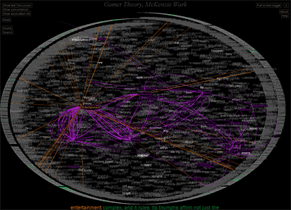
Let's back up: Mr. Paley's Text Arc is a visual representation of the occurence and frequency of each word used in Alice in Wonderland. The round frame of the image is made of the entire text of the book. The words inside the cirlce are sized according to occurence frequency (the more often the words appear the larger they are) and are placed onto the graph according to how often they appear at that point in the book. It's almost like elastic bands that stretch throughout the circular layout of the text pulling each word a certain direction.


The most interesting part about this is that the word "Queen" for instance appears at several points in the book before she even appears in person in the fictional storyline. The word in the Text Arc is positioned very close to where she actually appears as Carroll uses the word "Queen" more often when she is actually present in the plot. But the red strings show you where else in the book the Queen has been mentioned and shows how Carroll foreshadows the Queen's final appearance throughout the entire book.

Visual languages

Now that in itself might be nice and gimmicky, but what I found 'stupidly exciting' about this was that Paley created this visual vocabulary or information narrative structure which takes advantage of instant visual recognition of patterns. True, the structure is like Hebrew to a native Chinese speaker at first and has to be learned. But once you get what exactly he's visualizing, basically once you learn how to read this sucker, you can quickly pick up patterns within the data.

We learn how to read bar charts and line charts and by interpreting them formulate certain hypotheses about what this data could mean. Immediate visual impressions give the viewer the opportunity to concentrate on understanding the larger meaning of a complex set of data, rather than get lost in processing invidual words, numbers, etc. And while that is nothing new, Mr. Paley's Text Arc gives you the opportunity to apply this generally numerically driven concept of information visualization to a freaking book. Powerpower!
Anyhow.
Nerdy end to a very long day.
Narf.

Multimedia musings that seem outdated now


Conceiving a multimedia project is quite the challenge but encourages you to really go nuts with the tools at hand. A white screen is what you have at the beginning and with Adobe Flash, there is almost no limit to your creativity.

This degree really gave us the time to explore various questions that I've heard reiterated in larger newsrooms here and abroad: What the heck do I put in a video; how do I best convey numbers and who still cares about words?

So here are some lessons worth $50k in tuition fees and a lot of sleepless nights in a smelly computer lab: Text matters cause most net media consumers are bored office workers who love to procrastinate around lunch time (when the number of site viewers peak) and they don't want to be caught by their bosses combatting their boreout. Text is still the most effective way for getting you information quickly.

Videos are often not consumed in their entirety for the same reasons but are generally more powerful when it comes to telling more individualized stories. Slideshows are a little work-friendlier. Clicking away on the internet - from afar that looks like clicking away on a excel sheet, right?

And Interactivity. What can I say. Over the past year, I have fallen in love with Adobe Flash. The Flashplayer, that thing you have to download from the Adobe homepage when you're on an old, old PC, is what makes things beam in, move from left to right or click around on maps, photo galleries, etc.

Interactivity, if done properly, draws in a lot of people. Big time. Maybe not for longer than 30 seconds, but as the Internet is seen more and more as a resource to personalize and filter information according to one's own taste, the interactive feature that combines a lot of useful/interesting information with a compelling and easy-to-understand design wins. The LA Times did a crimewatch interactive (google map AIP), recording each murder that happened in Los Angeles. This data base is constantly updated and sorted by name, I presume daily. This lends it longevity that videos or slideshows might not have. Constantly upgraded, constantly renewed data.

To end on a good note:
http://www.wefeelfine.org/