Video art that a virtual acquaintance sent over. VERY inspirational in its use of video!

Showing posts with label art. Show all posts
Showing posts with label art. Show all posts
Thursday, August 20, 2009

Sunday, January 4, 2009
William Eggleston exhibition at the Whitney
William Eggleston has an exhibition at the Whitney at the moment. Find an interview with William Eggleston about some of the images from his current exhibition at the Whitney.
You can also see some of his images in the video/slideshow above as commented on by his son, Winston Eggleston, which I find even more interesting.
Some excerpts from the description of the video:
"Winston suspended his own photography career to be his father's photographic assistant. Winston and his brother took over running their father's archive in 1992, attempting to organize and catalog the entire body of work. Negatives were in different cities and many things were missing; there are many stories of boxes of prints vanishing after a late night of partying. Bill's generosity played a large role in giving away innumerable photographs.
During the interview, Winston provided a window into his father's life and background: he loves guns, but does not hunt; likes stamps, likes old rugs, and loves Bach. Most importantly Winston was able to impart the feeling of being along side his father while he photographed. He provides us with a context for each image and expresses an adoration of the photographs as only a son can."
The exhibition is called "Democratic Camera" and is a collection of what seem to be snapshots mostly from the South of the U.S. Living in the U.S. as a foreigner has always been both a pretty amazing and let's say, sometimes very difficult experience, both in Houston and now in New York. Seeing the U.S. through William Eggleston's lens is quite an intimate look at American life. Even inanimate objects like chicken presented nicely on ornate porcelain plates became symbolic manifestations of American life.
And of course, to quote his son:
"God Damn That's A Good Looking Blue."
But what this exhibition made me realize once more is that it's so important to drag my ass away from my computer every once in a while to get some inspiration. It's hard to get trapped in a few tricks that have worked for you in the past. I sometimes find myself stuck in the same compositions. And learning more software skills is not necessarily the solution. If only it weren't so freaking cold.
To end on another cheesy quote: 'Every photographer who has lasted has depended on other people's pictures'
-- photographer Robert Adams
In any case. Enjoy the videos. They are very nice.
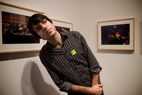
Daniel looking at another exhibition piece at the Whitney
Thursday, May 1, 2008
Learning about visual vocabulary
As nerdy as it sounds, my favorite class this semester has been Graphics in the Newsroom with Hannah Fairfield, a New York Times information graphic illustrator. And hey, seeing that the infographic has made a big comeback thanks to the internet, I am maybe even right in thinking that this skill might make me that much more employable in the world of journalism.
We've had a guest lecturer with the almost aristocratic name Bradford Paley come in to speak to us. His work is currently rubbing frames with that of Flash God Jonathan Harris and other computer graphic designers at the MoMA's "Design and Elastic Mind" exhibition and exhibits quite a different approach to reading of Lewis Carroll's Alice in Wonderland .
So the question is: Who the eff cares about a bunch of colorful lines that tie togther words used in Caroll's drug-glorifying fairy tale? Well, how many literature and creative writing majors are there in the world who've gotten stupidly excited about interpreting the written words of their idols?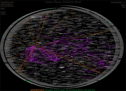
Let's back up: Mr. Paley's Text Arc is a visual representation of the occurence and frequency of each word used in Alice in Wonderland. The round frame of the image is made of the entire text of the book. The words inside the cirlce are sized according to occurence frequency (the more often the words appear the larger they are) and are placed onto the graph according to how often they appear at that point in the book. It's almost like elastic bands that stretch throughout the circular layout of the text pulling each word a certain direction.
The most interesting part about this is that the word "Queen" for instance appears at several points in the book before she even appears in person in the fictional storyline. The word in the Text Arc is positioned very close to where she actually appears as Carroll uses the word "Queen" more often when she is actually present in the plot. But the red strings show you where else in the book the Queen has been mentioned and shows how Carroll foreshadows the Queen's final appearance throughout the entire book.
Visual languages
Now that in itself might be nice and gimmicky, but what I found 'stupidly exciting' about this was that Paley created this visual vocabulary or information narrative structure which takes advantage of instant visual recognition of patterns. True, the structure is like Hebrew to a native Chinese speaker at first and has to be learned. But once you get what exactly he's visualizing, basically once you learn how to read this sucker, you can quickly pick up patterns within the data.
We learn how to read bar charts and line charts and by interpreting them formulate certain hypotheses about what this data could mean. Immediate visual impressions give the viewer the opportunity to concentrate on understanding the larger meaning of a complex set of data, rather than get lost in processing invidual words, numbers, etc. And while that is nothing new, Mr. Paley's Text Arc gives you the opportunity to apply this generally numerically driven concept of information visualization to a freaking book. Powerpower!
Anyhow.
Nerdy end to a very long day.
Narf.
We've had a guest lecturer with the almost aristocratic name Bradford Paley come in to speak to us. His work is currently rubbing frames with that of Flash God Jonathan Harris and other computer graphic designers at the MoMA's "Design and Elastic Mind" exhibition and exhibits quite a different approach to reading of Lewis Carroll's Alice in Wonderland .
So the question is: Who the eff cares about a bunch of colorful lines that tie togther words used in Caroll's drug-glorifying fairy tale? Well, how many literature and creative writing majors are there in the world who've gotten stupidly excited about interpreting the written words of their idols?
Let's back up: Mr. Paley's Text Arc is a visual representation of the occurence and frequency of each word used in Alice in Wonderland. The round frame of the image is made of the entire text of the book. The words inside the cirlce are sized according to occurence frequency (the more often the words appear the larger they are) and are placed onto the graph according to how often they appear at that point in the book. It's almost like elastic bands that stretch throughout the circular layout of the text pulling each word a certain direction.
The most interesting part about this is that the word "Queen" for instance appears at several points in the book before she even appears in person in the fictional storyline. The word in the Text Arc is positioned very close to where she actually appears as Carroll uses the word "Queen" more often when she is actually present in the plot. But the red strings show you where else in the book the Queen has been mentioned and shows how Carroll foreshadows the Queen's final appearance throughout the entire book.
Visual languages
Now that in itself might be nice and gimmicky, but what I found 'stupidly exciting' about this was that Paley created this visual vocabulary or information narrative structure which takes advantage of instant visual recognition of patterns. True, the structure is like Hebrew to a native Chinese speaker at first and has to be learned. But once you get what exactly he's visualizing, basically once you learn how to read this sucker, you can quickly pick up patterns within the data.
We learn how to read bar charts and line charts and by interpreting them formulate certain hypotheses about what this data could mean. Immediate visual impressions give the viewer the opportunity to concentrate on understanding the larger meaning of a complex set of data, rather than get lost in processing invidual words, numbers, etc. And while that is nothing new, Mr. Paley's Text Arc gives you the opportunity to apply this generally numerically driven concept of information visualization to a freaking book. Powerpower!
Anyhow.
Nerdy end to a very long day.
Narf.
Subscribe to:
Posts (Atom)